
Wild Access.
For Every. Body
Ulster County New York found itself in the unique position of being one of the most accessible counties in the New York area, whether hiking, biking, shopping, or just unwinding in the Catskills. A unique sub-brand was developed to sell accessibility to would-be tourists; one that could be bold, proud, and above all, accessible.
A logo lockup was developed that communicated both the idea of exploring the wild, but also using the idea of the accessibility of Ulster County as being “wild”, or out of the ordinary. The forward leading chevrons further communicates an idea of progress, movement, and diversity.
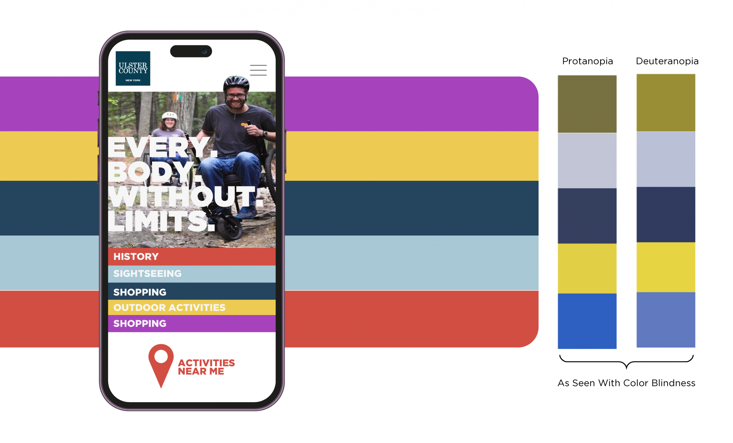
A color palette was selected with accessibility in mind. Too often color palettes are chosen solely for their aesthetic purposes, but in this case the client needed to be able to effectively communicate and differentiate colors to persons who may have color blindness. The example above demonstrates how the base palette translates to different kinds of color-blindness.
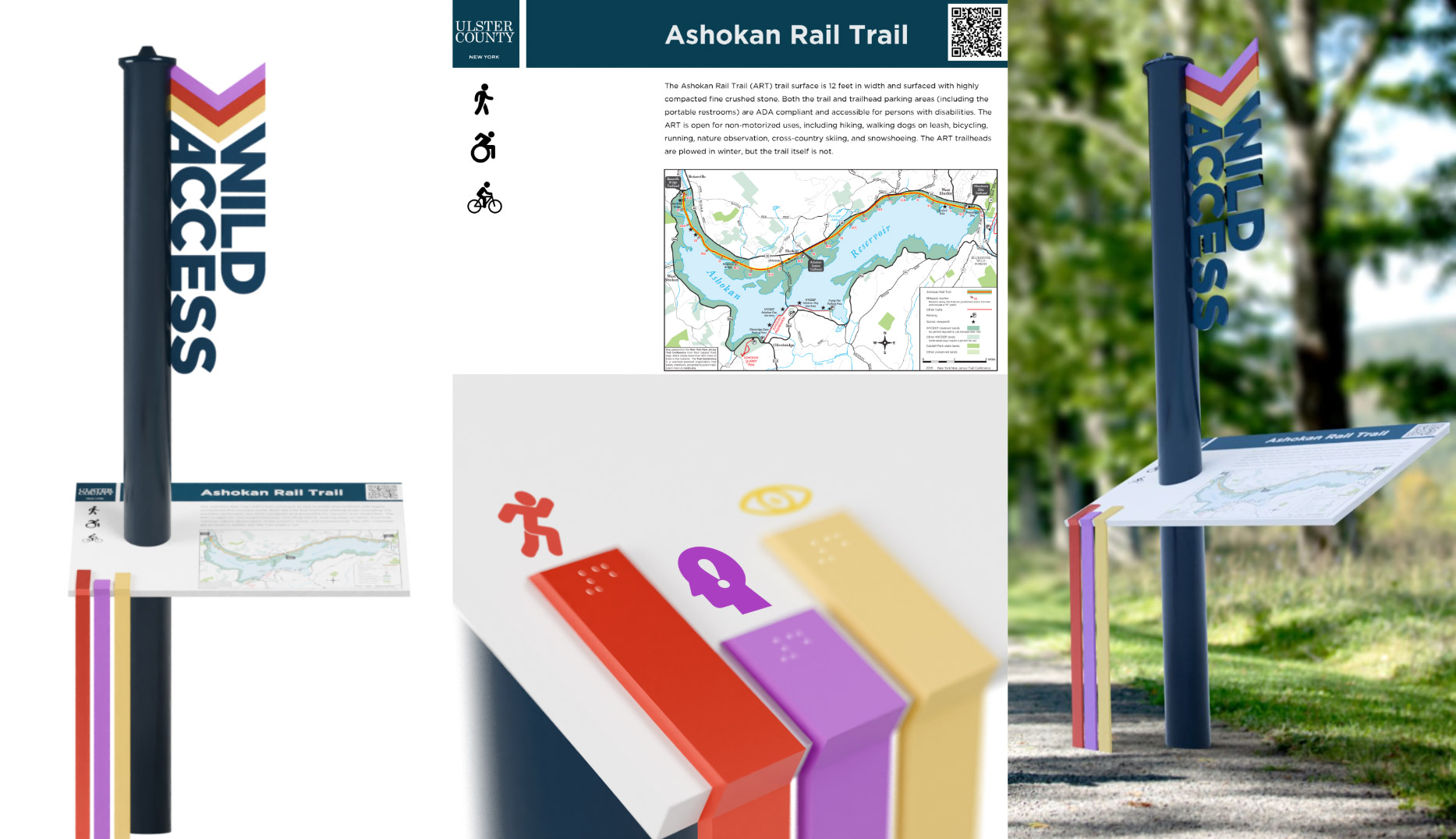
To go along with the new sub-brand, a way-finding system was developed that would support the accessibility efforts of the county, providing intuitive indicators of physicalality, mental stimulation, and degree of sight required to perform the activity.
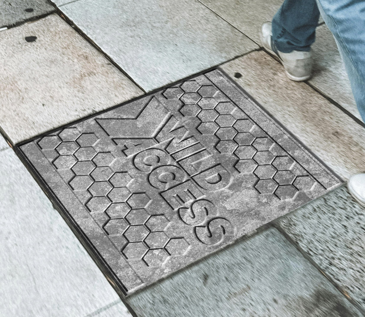
Custom pavers were also proposed to be placed in front of areas that are accessibility-friendly. Not only are they visible indicators of a location’s status, but their unique texture serves to act as an indicator for blind persons using a cane to navigate.